
AI image generators can make images that look like pixel art. The result often misses the rules of pixel art. The fake pixels are not real pixels. They are small groups of screen pixels. Edges blur. Colors spread. The grid drifts.
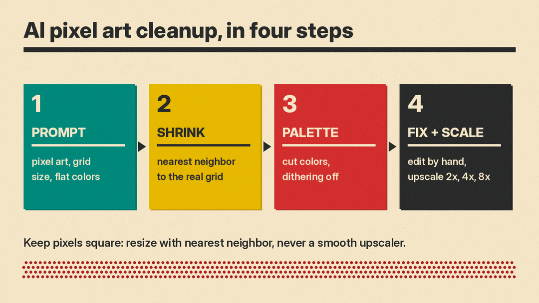
A better workflow has two parts. First, prompt the image generator for pixel art. Second, clean the result. Shrink it to a real grid. Cut the palette. Fix important shapes by hand. Then display it with a sharp upscale.
The goal is not to make AI produce final art in one pass. The goal is to make AI produce raw material that can become pixel art after cleanup.
What counts as real pixel art?
Real pixel art starts with a small grid. Common sprite sizes include 16x16, 32x32, and 64x64. Each pixel is placed on purpose. The artist chooses where the eye is. The artist chooses where the outline is. The artist chooses which block of color means shadow and which means light.
A small grid makes every choice visible. There is nowhere to hide. If a shape must be readable, it may depend on one or two pixels. If a pose must feel clean, the silhouette needs simple, strong blocks.
Real pixel art also uses a limited color palette. It does not use every color in the visible range. It uses a small set of colors chosen to work together. The edges are hard. A dark outline meets a lighter fill in a clean way. There are no soft blends between shapes. The image looks crisp because the color changes happen at whole grid units.
This is why fake pixel art feels off. It may look like a small pixel art picture from far away. Up close, the grid breaks.
Why does AI pixel art look fake?
Image generators usually draw at high resolution. They create many screen pixels for a single imagined block. That is why a fake pixel may be a blob. The blob can have uneven width and height. It can drift off a regular grid. Two fake pixels may be the same size, then the next row shifts.
The color problem matters too. Generators mix colors smoothly. They use gradients. They use antialiasing. That softens edges. In photos, soft edges look natural. In pixel art, soft edges break the form. The eye expects one color block, then another color block, with no fuzzy middle.
A generator has not placed pixels one by one. It predicts a finished image. It may imitate a style without honoring the grid. The result can be close in theme but wrong in structure. It may capture a character, an item, a tile, or a room. It still may not behave like real pixel art.
So AI output can look close at first. The shape and theme may be right. The structure may still be wrong. It needs cleanup.
How do you prompt AI for pixel art?
Prompting can reduce mess. It will not fix every issue, but it gives the cleanup stage a better source. Ask for pixel art. Ask for a small grid size. Ask for a style that hints at the era or view. Add constraints. A good prompt is short and specific.
Useful prompt ingredients:
- pixel art
- a grid size such as 16x16, 32x32, or 64x64
- a style word such as 16-bit, 8-bit, or isometric
- a limited palette
- flat colors
- no gradients
- no antialiasing
- a plain background or a transparent background
- one subject for sprites
- front view or side view for sprites
These terms help the generator keep shapes simple. They also help you notice what failed. If the output has a messy background, change the prompt. If the output uses a gradient, add no gradients. If the grid looks uneven, shrink it after the fact.
Keep one idea per image. Complex scenes produce more cleanup. A plain or transparent background is often easier to work with, especially for sprites. For item icons, keep one object. For characters, keep one figure. For tiles, think about what belongs near the edges. For rooms, decide the view first, such as isometric.
Example prompts:
- pixel art character sprite, 32x32, 16-bit, limited palette, flat colors, no gradients, no antialiasing, transparent background, front view, one subject
- pixel art item icon, 16x16, 8-bit, limited palette, flat colors, no gradients, no antialiasing, plain background, one object, centered
- pixel art tile, 32x32, 8-bit, limited palette, flat colors, no gradients, no antialiasing, one surface, centered subject
- pixel art scene, 64x64, isometric, limited palette, flat colors, no gradients, no antialiasing, plain background, one main building
- pixel art portrait, 32x32, 16-bit, limited palette, flat colors, no gradients, no antialiasing, front view, one head, centered
- pixel art room, 64x64, isometric, 8-bit, limited palette, flat colors, no gradients, no antialiasing, one room, plain floor
How do you shrink AI pixel art to a real grid?
The first cleanup step is to force the image onto a small grid. Estimate the fake block size. Look for repeated groups of pixels that form one square. If many small squares look the same, choose one square as one pixel.
Downscaling is the key. You want one fake block to become one real pixel. Use a nearest neighbor resize. Nearest neighbor takes the pixel value from a chosen location. It does not blend nearby colors. That matters for pixel art.
In the Python Pillow library, Image.resize takes a resampling filter. Resampling.NEAREST is one option. For RGB and most other modes the default filter is Resampling.BICUBIC, which blurs pixel art, so choose NEAREST. (Pillow always uses NEAREST for mode "P" and "1" images.)
This step can be rough. It may leave uneven edges. It may merge shapes. It may lose detail. That is normal. The goal is to get the image into a usable grid before polishing. Once each block is one pixel, later fixes become easier.
If the image becomes too small, keep the original. Do not destroy the source. Work from a copy, then shrink again if needed.
How do you cut the palette?
Pixel art needs a small palette. AI output often has too many colors. Cut them.
Pillow can convert an RGB image to mode "P" with an adaptive palette and a colors setting. Pass palette=Palette.ADAPTIVE, because the default is the fixed Palette.WEB. The default colors setting is 256 colors. For real pixel art, use far fewer colors if the image supports them. If it becomes too dark or muddy, you can allow more, but start low.
Fewer colors can improve contrast. They can also remove noise. A palette acts like a rulebook. It tells the image which colors are allowed. Once the palette is fixed, the sprite can look more intentional.
Watch dithering. Dithering can add noise that looks like fake texture. Pillow gives dithering options as NONE or FLOYDSTEINBERG. FLOYDSTEINBERG is the default. Turn dithering off for a clean flat look.
For palette ideas, browse Lospec. It hosts a list of pixel art palettes. Pick a palette, then rebuild the color choices after the downscale. A fixed palette makes the sprite feel intentional. It also helps a set of sprites feel related.
How do you fix the sprite by hand?
Even a good prompt and a good downscale need manual work. Open the result in a pixel editor. Aseprite is a pixel art editor. Its docs say you set sprite size in File > New and can later change canvas size or resize sprite content. It also has a command line interface.
Zoom in. Work one pixel at a time. Look for the parts that read as art. Fix stray pixels. Remove dots that do not belong. Clean the outline. Make sure dark edges do not become thin and patchy. Check the eyes. Small changes there affect personality. If the character faces forward, make the eyes line up. If the sprite has symmetry, make both sides match or decide which side should differ.
Manual fixes can be small. One pixel can change a hand. Two pixels can fix a shadow. The cleanup is where the work becomes real pixel art.
Do not fear deleting pixels. A clean sprite often has less detail than the AI result. A few strong shapes are better than many weak ones.
How do you scale pixel art for display?
When you display pixel art, scale it up with whole numbers. Common choices are 2x, 4x, and 8x. Use nearest neighbor. Nearest neighbor keeps each pixel as a sharp square. It does not blend the edges.
Do not use smooth upscalers on pixel art. General AI upscalers smooth pixels, which is right for photos and wrong for pixel art. If you need help choosing an upscaling method, read our AI image upscaling guide.
A small sprite can look great on a high resolution screen if you respect the grid. A large canvas is not always better. The display size is separate from the sprite size. Keep the source sprite small and crisp.
If you use a scale factor that is not a whole number, pixels can become uneven. The squares may look stretched, squashed, or blurry. For game sprites, tile sheets, portraits, and icons, whole number scaling is the safe choice.
How do you get transparent backgrounds for sprites?
Transparent backgrounds help sprites move over game tiles and UI panels. Some image tools can output a transparent PNG directly. Check your tool's docs for a background or transparency setting, and ask for a transparent background in the prompt.
If the generator gives you a plain background instead, you can remove it later. For tips on background removal, read How to Make Stickers With AI.
In a pixel editor, transparency is not just a hole. It is a place where the background should show. Check for faint pixels around the edge. Those are often leftover from the original background or from antialiasing. Delete them unless they are intended soft edges, which pixel art usually avoids.
For sprites, a transparent background is often better than a white background. White pixels around a character can show as a glow when placed over dark tiles. A clean transparent edge keeps the character part of the scene.
How do you keep a sprite set consistent?
A set of sprites feels better when the parts share rules. Reuse the same prompt wording. Reuse the same grid size. Reuse the same style words. Reuse the same palette.
Some tools support seeds. A seed can help keep style closer between images. See AI image settings: seed, aspect ratio, guidance for using a fixed seed where a tool supports it.
Also watch the size of the subject. If one sprite fills the grid and another looks small, the set will feel uneven. For characters, choose a standing height. For items, choose a shape that fits inside the grid. For tiles, decide what belongs near the edges. Small shared rules create a believable world.
A simple sprite sheet can help. Place a few test characters or items together. If they look like they came from different places, simplify the palette or repeat the outline style. If the grid sizes differ, make them match before hand fixing.
What is the quick checklist?
Use this checklist when your AI pixel art looks almost right.
- Prompt with pixel art, a grid size, and a style word.
- Ask for limited palette, flat colors, no gradients, and no antialiasing.
- Ask for one subject and a front or side view for sprites.
- Ask for a plain background or transparent background when possible.
- Estimate the fake block size.
- Shrink the image to a real grid with nearest neighbor.
- Convert to a limited palette.
- Turn dithering off for a clean look.
- Fix outlines, eyes, stray pixels, and symmetry in a pixel editor.
- Upscale only by whole numbers such as 2x, 4x, or 8x.
- Save sprites as PNG when you need transparency.
- Keep prompt wording and palette stable across a sprite set.
