
A poster or flyer has one job: get a few facts in front of the right people fast. A name, a date, a place, and a reason to show up. AI tools can now help with much of the visual work, from the background art to the layout. They still need you for the words, the facts, and the final check.
This guide walks through a simple workflow that works for event posters, shop flyers, school notices, and social graphics. It uses three kinds of tools: a template editor with AI features (such as Canva or Adobe Express), an image generator that is good at text (such as Ideogram), and your own eyes.
Why posters are a good fit for AI, and where they are not
Posters mix two things that AI handles very differently.
The first is the image: a mood, a scene, an illustration, a texture. Image generators are strong here. You can describe "a risograph-style poster of a bicycle on a country road" and get several options to choose from.
The second is the text: the event name, the date, the address, the price, the web link. Here a single wrong letter ruins the poster. Ideogram's own documentation says its model handles titles and short blocks well, and recommends adding body copy or full documents later in a design tool. It also says each extra word raises the odds of a typo or a dropped letter, and that text is most accurate in English, while non-Latin scripts and accented letters can come out wrong (Ideogram docs).
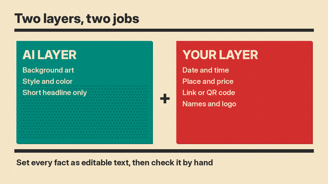
That split suggests the core rule of this guide: let AI make the art and, at most, a short headline. Put every fact in as editable text.
Step 1: Write the content before you open any tool
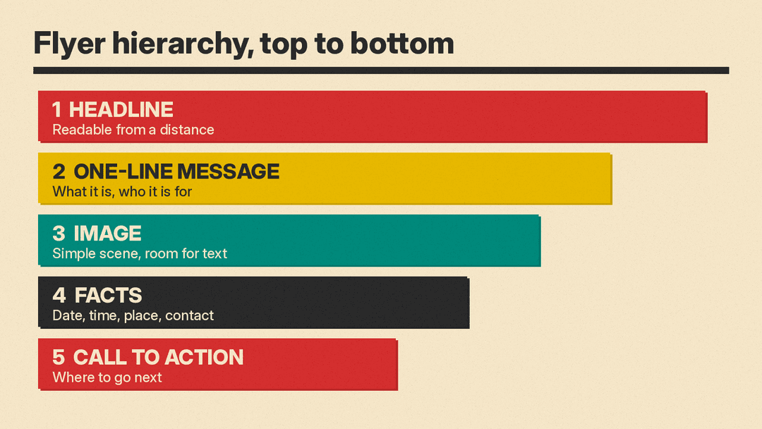
Start with a plain text note. Most flyers need the same short list. Canva's flyer guide lists the parts of an effective flyer: a catchy headline, a clear message, suitable typography, visual hierarchy, white space and images, and a call to action (Canva). It also suggests adding contact details such as your website, email and phone number, plus key details like the date and time of an event.
Write yours out:
- Headline: three to six words that someone can read from across a room.
- One line that says what it is and who it is for.
- The facts: date, time, place, price or "free", age limits.
- The action: scan a code, visit a link, call a number, show up.
- Your logo or name, if you have one.
Ask a chat assistant to tighten the headline if you like ("give me ten three-word headlines for a neighborhood bake sale that raises money for the library"). Keep the facts out of the AI step. You already know them, and a model can only get them wrong.
Step 2: Choose your size and format first
Size changes the layout, so pick it before you design. Canva's FAQ gives 8.5 x 11 inches as the most common flyer size, with 11 x 17 for larger flyers and 5.5 x 8.5 for smaller ones (Canva). Adobe Express templates also come in sizes such as 5 x 7, 7 x 9 and 11 x 17, and its Resize feature takes custom dimensions (Adobe Express).
If the same design must also work as a social post or story, plan for that now. A tall flyer and a square post need different crops, and resizing a finished design often pushes text into awkward places.
Step 3: Start from a template or a prompt
You have two good starting points.
A template editor. Canva and Adobe Express both offer large libraries of flyer templates for purposes such as events, grand openings, real estate and school notices. Both now include AI features inside the editor. Canva's Magic Studio includes Magic Media, which turns text into images, Magic Edit, which adds or replaces parts of an image from a short prompt, and Magic Eraser, which removes distractions. Canva's page marks Magic Edit and Magic Eraser as Pro features (Canva). Adobe Express can create templates from a text prompt, apply styles or textures to letters from a prompt, and insert or remove objects you describe (Adobe Express).
This route is the safest for beginners. The text stays editable, the layout already has a hierarchy, and you can swap in AI images where the template has stock photos.
An image generator. If you want a poster that looks like art first, generate the visual in a tool that handles typography well, then bring it into an editor. This route gives more original results but needs more cleanup.
Step 4: Prompt the art, and leave room for the words
When you prompt for poster art, describe the space as well as the scene. A few patterns help:
- Name the style: "Swiss-style poster", "1960s travel poster", "flat vector illustration", "risograph print", "bold geometric shapes".
- Name the palette: two or three colors work better than "colorful".
- Reserve space: "large empty area in the top third for a headline", "plain background on the lower half".
- Keep it simple. Ideogram's guide notes that a busy scene leaves less room for clean lettering (Ideogram docs).
A sample prompt for art with no text:
"Flat vector poster illustration of a sunny farmers market stall with crates of apples and bread, cream background, red and teal palette, large empty space across the top third, no text."
Generate several versions, then pick the one with the cleanest open space, not only the prettiest picture.
Step 5: If you want AI lettering, follow the text rules
Sometimes the headline should be part of the art, such as words painted on a wall or curving along the bottom of a vintage design. Ideogram's documentation gives clear rules for this (Ideogram docs):
- Put the exact words in quotation marks. Keep the spelling and capitals you want.
- Mention the text early in the prompt. Text named near the start comes out more reliably.
- Say where the text sits, such as "across the top" or "curving along the bottom".
- Describe the lettering by its weight, shape and mood ("bold sans-serif", "thin rounded Bauhaus style") rather than naming a font.
- For more than one block of text, describe each block in reading order, from top to bottom, with its own words, style and place.
The docs give a jazz poster as an example of the last rule: a headline at the top in large gold serif capitals, a line of details below the main figure, and a venue name at the bottom in small sans-serif capitals.
Even so, keep the AI lettering to the headline. Put the date, address and link in as real text in the editor.
Step 6: Fix bad text instead of starting over
Generated text can still come back with a doubled letter or a missing word. Ideogram suggests trying, in order: generate again, swap long or unusual words for shorter ones, then fix just the text with an edit so the rest of the image stays the same (Ideogram docs). Its Studio can also turn text in an image into editable layers that you can retype, move or restyle, though the docs note that detection does not work for every decorative or distorted word.
The same docs make a useful point: it is often easier to keep an image whose text is right and fix the scene around it than the other way round.
In Canva or Adobe Express, the simplest fix is often to cover the generated word with a shape in the background color and type the correct word on top.
Step 7: Assemble the layout in an editor
Import the art into your editor and add the text from your note. A few rules from the tool makers' own guides:
- Make the headline bold enough to read from a distance (Adobe Express).
- Add a clear call to action so readers know where to go or who to contact next.
- Keep key messages away from the edges to give the design room to breathe.
- Keep the message simple and focused on one main point.
- Pick a font that is easy to read, so the flyer works for more people.
Use your brand colors and logo if you have them. Both editors support brand settings: Adobe Express calls this a Brand Kit, and Canva lets you add your logos and colors to keep branding consistent.
Step 8: Check every fact by hand
This is the step that AI cannot do for you. Before you export, read the poster out loud, slowly:
- Is the date right, including the day of the week?
- Is the time right, with AM or PM?
- Is the address complete?
- Does the link or QR code open the right page on your own phone?
- Are names spelled right?
- Is there any stray AI text hiding in the background art, such as fake words on a sign?
Zoom in on the art itself. Image generators sometimes add small nonsense letters on signs, labels or clothing. Erase them or crop them out.
Step 9: Export for print or screen
Pick the file type for where the poster will live. Adobe Express exports PDF, JPG or PNG, and notes that PDFs are best for professional printing while JPGs and PNGs work best for digital use. An animated flyer can be downloaded as an MP4 video (Adobe Express). Canva offers a print PDF download and its own print service (Canva).
For home printing, print one test copy first and check that every line is easy to read on paper.
Example: a library book swap flyer
Here is how the steps fit together for a simple community event:
- Note: "Library Book Swap. Bring a book, take a book. Saturday 10 AM to 2 PM. Main Street Library. All ages."
- Art prompt: "Flat illustration of stacked colorful books and a reading lamp, mustard and teal on cream, large empty area at top, no text."
- Editor: place the art, add "BOOK SWAP" as a bold headline at the top, the one-line description below, and the facts in a clear block at the bottom.
- Check: read every fact, test the QR code, look for stray AI letters.
- Export: PDF for printing, PNG for the library's social account.
Common mistakes
- Asking the image model to write the whole flyer. Long text is where it fails most.
- Picking art with no space for words, then squeezing the text into a corner.
- Too many fonts. Two is usually enough.
- Low contrast, such as light text on a busy photo. Add a solid block behind the text.
- Skipping the fact check because the design looks finished.
The short version
Use AI for the look and a short headline. Use an editor for every fact. Then check it all by hand before it goes to print. That split keeps the speed of AI and removes its most common failure on posters: wrong or garbled words.
For related guides on llms.blog, see how to write AI image prompts and how to design a logo with AI.
